
Color has a way of capturing what words sometimes can’t. For Fort Lauderdale, that now means eight custom Pantone shades.
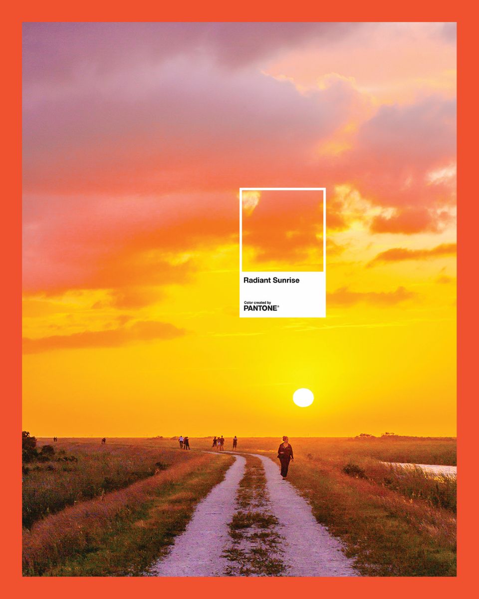
Visit Lauderdale, the official destination marketing organization for Broward County, has partnered with the Pantone Color Institute to develop a custom color palette built around the character of the area. The collection draws from the destination’s most recognizable features: the blue-green of the Intracoastal, the golden cast of late-afternoon light on the beach, the soft haze of ocean air. Each of the eight shades carries a name to match, including Radiant Sunrise, Nautical Breeze, LauderTeal, Seafoam, Ocean Mist, and Golden Shore.
“Greater Fort Lauderdale has always been a destination defined by its natural beauty, vibrant culture, and unmistakable energy,” says Stacy Ritter, president and CEO of Visit Lauderdale. “Through this collaboration with the Pantone Color Institute, we’ve translated those qualities into a visual language that captures the essence of our community. This palette gives us a new way to tell our story and celebrate the people, places and experiences that make Greater Fort Lauderdale so distinctive.”
The shade names were developed with local input. Visit Lauderdale invited tourism and hospitality stakeholders to help identify them during the organization’s annual marketing luncheon.
“Greater Fort Lauderdale is a destination where color lives and breathes, from the luminous blues of the Intracoastal to the warm, golden tones that settle across the shoreline at dusk,” says Laurie Pressman, vice president of Pantone Color Institute. “Working with Visit Lauderdale, we translated that sensory experience into a custom palette that captures the distinct personality and energy of the destination.”
Visit Lauderdale plans to incorporate the palette across marketing campaigns, creative partnerships, events and visitor experiences. The full collection, along with the story behind each shade, is available at visitlauderdale.com/pantone.